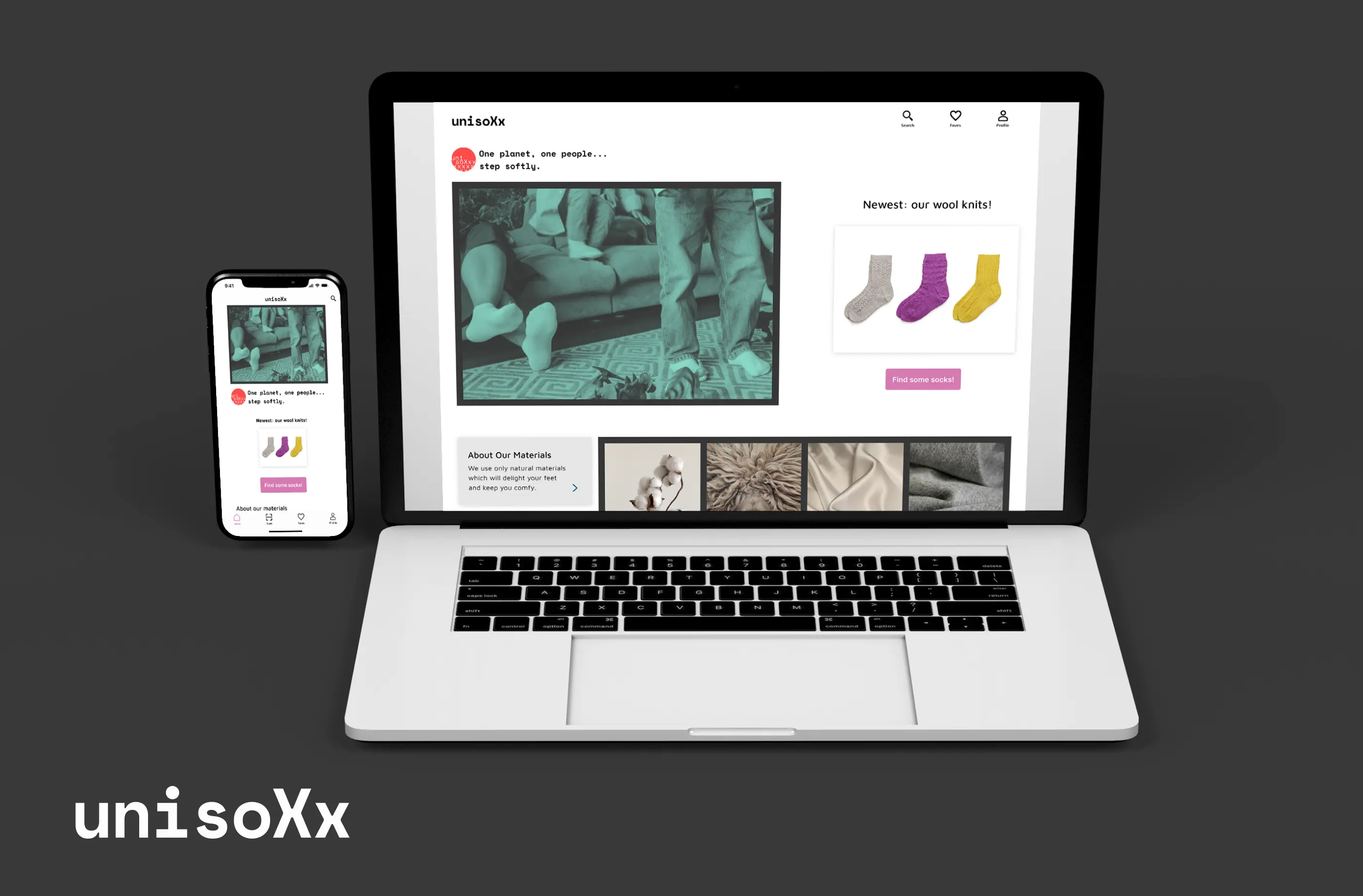
Unisoxx: Designing an Online Shop
A mobile and web app, designed with a focus on branding and usuability.
Deliverables
The project brief required the following deliverables for one task flow:
- User flow diagram
- Wireframes
- User testing notes & results
- User interface design
- Desktop design
- Mockups
- Bonus: Animation
- Bonus: Second Task Flow
How do you shop online when gender is not a concern?
I'd recently bought shoes online and spent hours comparing size charts. Measuring my feet, my mind went to gender-fluid shoppers. How would they shop online when they weren't beholden to Men's and Women's sizes? How could they find their size quickly and easily without thinking about gender?
So I approached the project from the perspective of a gender-fluid tech-savvy, Gen Z shopper. How would they shop for socks?
New gender norms:
- According to new research, 38% of Gen Z respondents “strongly agreed” that gender no longer defines a person as much as it used to.
- 55% of consumers 13 to 20 years old know someone who uses gender neutral pronouns “they”, “them” or “ze” versus “he” or “she”.
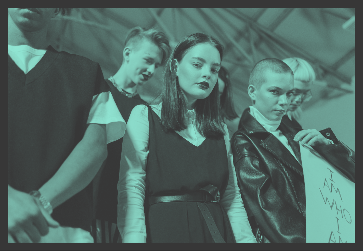
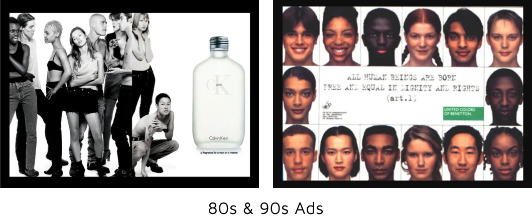
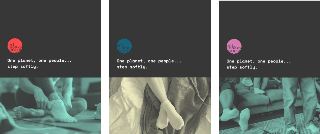
Awareness in Branding
Looking to awareness brands like 1980-90s Benetton and the unisex Calvin Klein One perfume campaign for inspiration, I created brand guidelines. Focusing heavily on inclusivity to build credibility among the Gen Z users, I also wanted to tap in to 80s - 90s nostalgia to appeal to older users.
Branding Guidelines


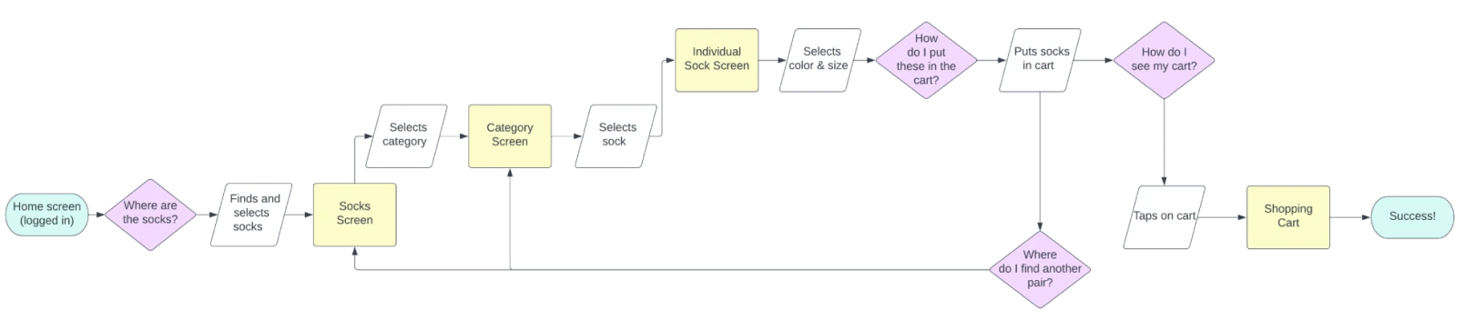
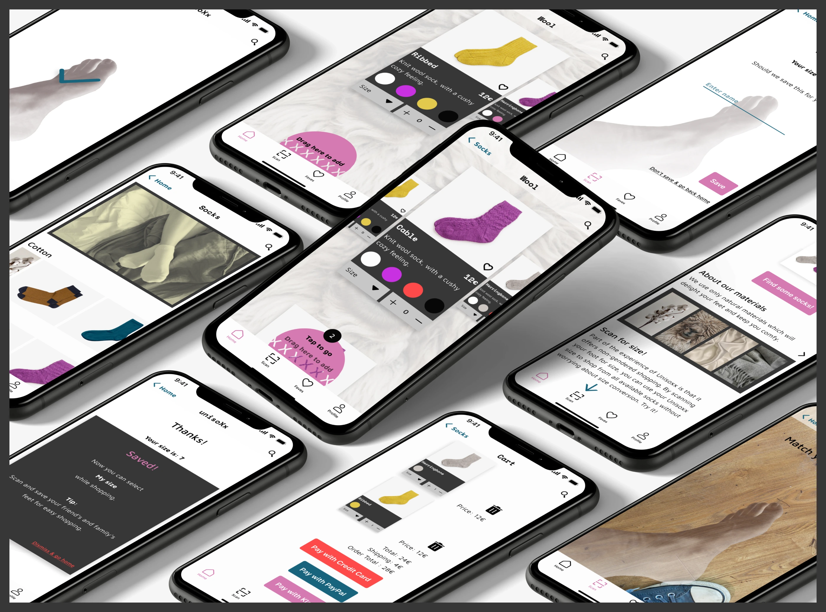
Task Flow: Shopping Cart
Since every brand needs income, I chose to design the shopping cart for the required task flow.
User Task
Your feet are cold and you need two new pairs of wool socks. Find two pairs and put them in the shopping cart.
Wireframes for Product Screen


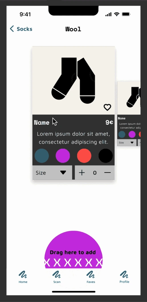
Prototype 1: Shopping Cart
The brand has a small catalog and I wanted to design a satisfying interaction for shopping on a mobile device. So I utilized multi-directional swiping with animations in a mid-fidelity prototype made in Figma.
Prototyping Insight
This was the first time I had worked with multi-directional swiping in Figma. With the help of some trial and error and YouTube tutorials, I managed to figure it out — smart animations were the secret!
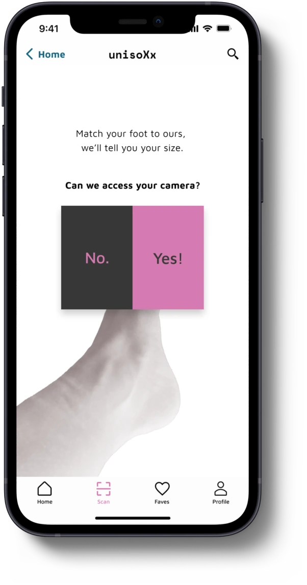
Prototype 2: Scan for Size
Before my first user test I had a couple of spare hours, so I decided to work on the bonus task flow. I remembered using an airline app with AR to scan my carry-on luggage for size. So I snapped a picture of my foot and made some simple, text-based wireframes to test the concept with my users before committing to it.
Problem Statement
As a non-binary person, I want to be able to buy a simple item like socks without thinking about gender, so I can feel less anxious while shopping.
User Testing
Using Google Meet and Quicktime for screen recording, I remotely tested three participants using moderated testing. Happily, all three participants completed the task with zero errors.

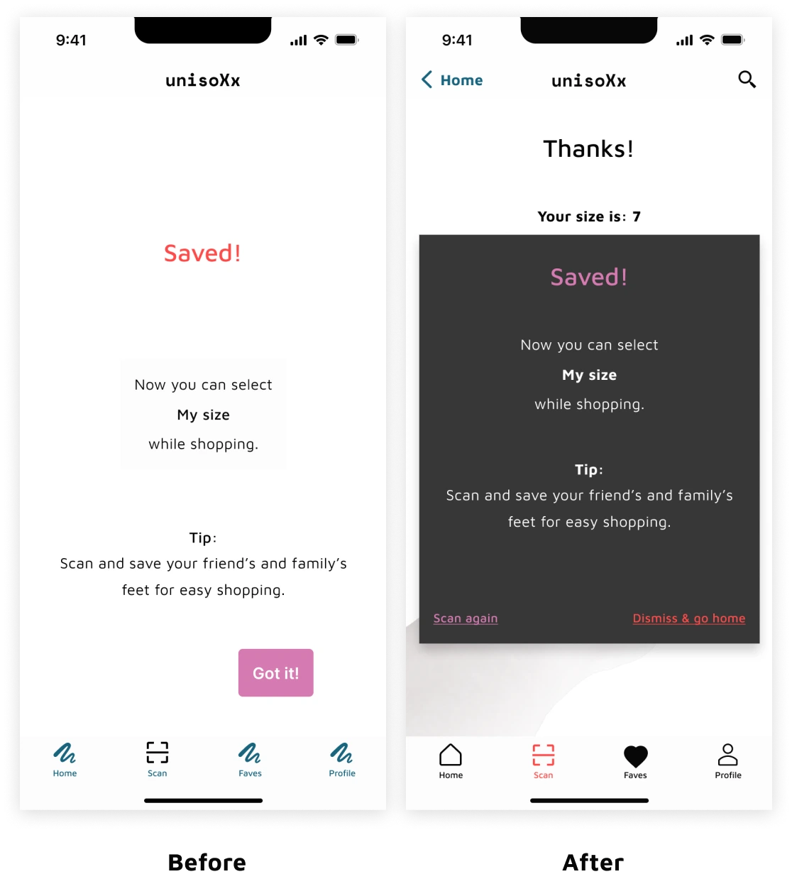
Negative User Feedback
“I wonder if the whole saved screen can be some sort of modal. If I click on "Got it" I don’t know exactly where I would go.”
Planning ahead and proper time management are key.
This project taught me I can turn out high quality work in a short period of time.
Luckily, I’m adept at breaking down tasks so that I always have something to work on. Even when waiting on participants schedules to complete user testing, I never let spare time go to waste.
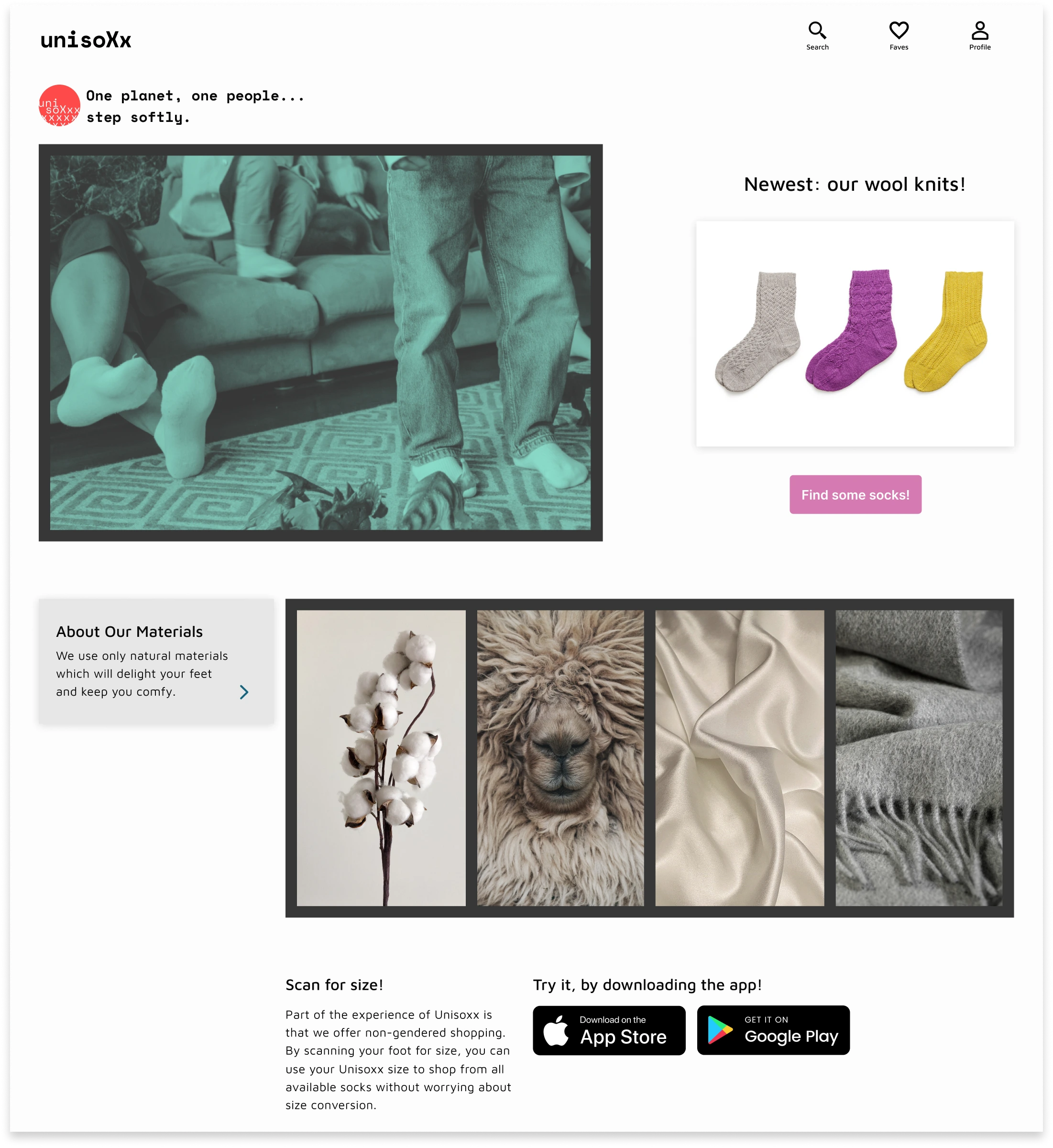
But... what about the developers?
While designing, I couldn't keep this question from creeping in to my mind. How would developers feel about my designs?
Since I'm a practical person with a love for learning, I redesigned my desktop homepage starting from this simple mockup on the left. Then I found a mentor and learned Webflow. I built the newly designed homepage and launched my first website.